Master Workday Training in Hyderabad’s Leading Experts
Workday Prism Analytics Course in Hyderabad
Let us step you into its exciting world of advanced and matrix reports. These advanced reports allow for detailed data extraction that meets specific business needs.
Before creating any report, the key components must first be identified; such as understanding requirements and selecting suitable data sources.
Matrix reports are different; instead of providing detailed reports that focus on individual details, these allow you to group and summarize data much like using pivot tables in Excel.
Compose reports in Workday Prism Analytics Course in Hyderabad rely heavily on matrix reports as part of their foundation.
Exploring Workday Prism Analytics
Exploring Workday Prism Analytics numerous features of Workday Prism Analytics were highlighted, showing just how dynamic and user-friendly data analysis can be.
Imagine working with 29 employees divided among various grades; 17 of whom being non-management workers.
Workday Prism Analytics made viewing details about these 17 employees simple; its system automatically provided parameters from the data source for easy sorting and viewing of detailed information.
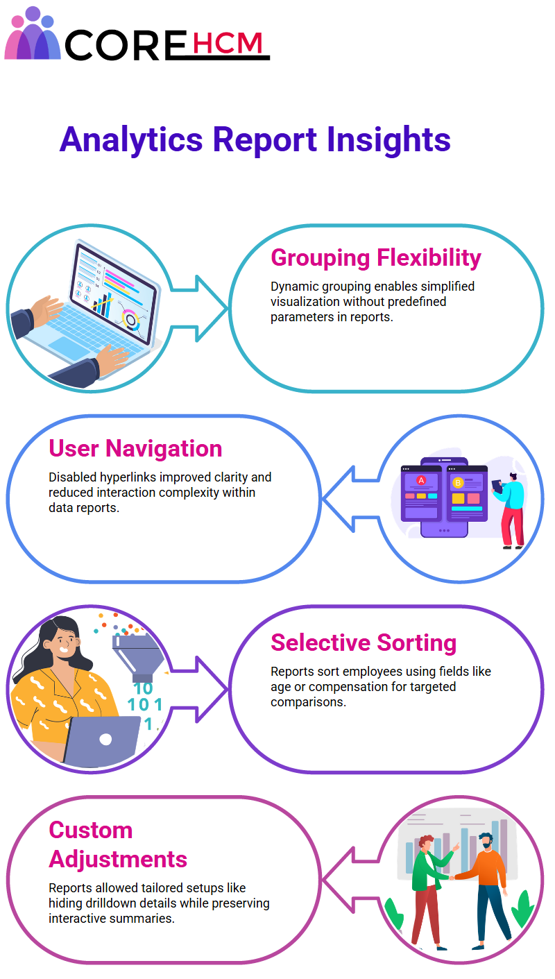
One of the key advantages of Workday Prism Analytics is its “view by” or drilldown options, one of which being its “view by” capability.
This functionality enables data to be dynamically grouped without adding explicit parameters into a report.
To increase clarity, default drilldown values were limited by selecting specific reliable fields such as age group, compensation grade and management level before running another report.
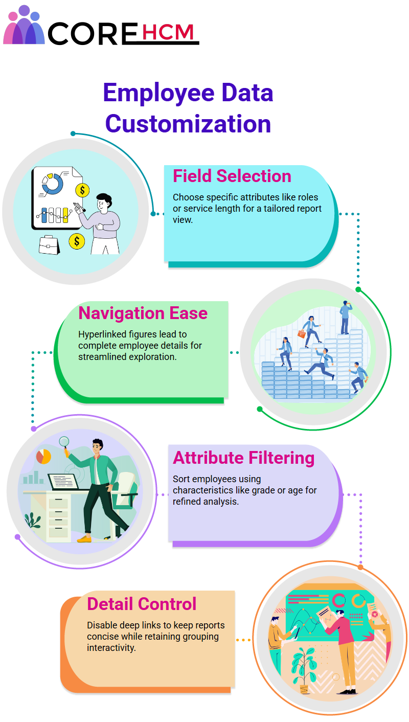
By restricting to certain fields, only relevant ones were available, creating better focus. Another useful aspect of Workday Prism Analytics Course in Hyderabad is being able to disable links within reports.
Initial behavior saw clicking any number reveal more data followed by an option to “view by,” however this behavior was altered by disabling all drilling for the report so none of its data points appeared as hyperlinks this made for easier navigation of the report and an overall cleaner presentation.
Sorting data within Workday Prism Analytics was also explored. Employees were organized based on age ascending order for efficient analysis of trends among them.
Drilldown options provided further flexibility by enabling custom adjustments such as disabling details while keeping dynamic grouping abilities active. These modifications significantly increased the functionality of reports.
As part of my exploration of Workday Prism Analytics, the flexibility offered for viewing and grouping data became clear.
Use Cases of Workday Prism Analytics Matrix Reports
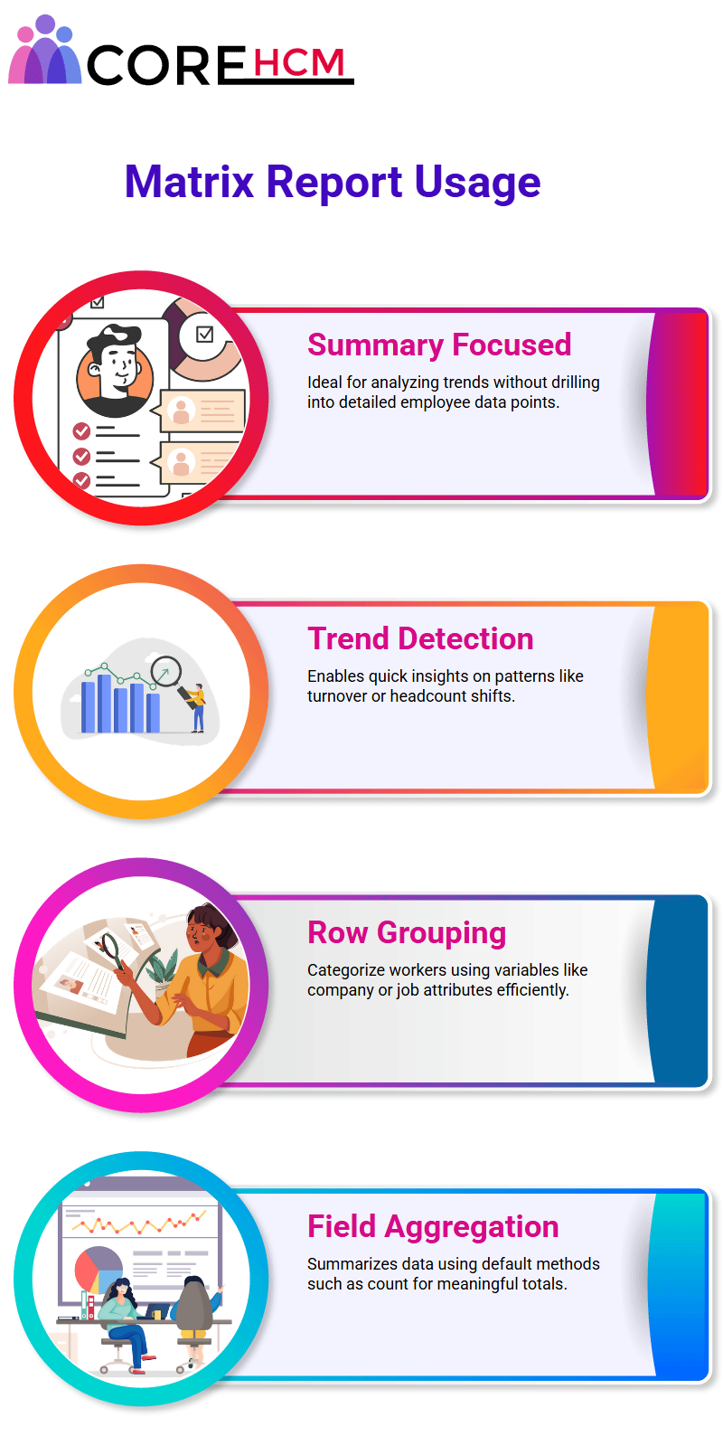
Matrix reports are ideal when summarizations or high-level analytics are required, rather than delving deep into employee details.
Instead of diving down to employee level details like turnover rates or job level variation data.
Instead, they help pinpoint trends such as turnover rates or headcount variations more efficiently than individual employee details would.
Workday Prism Analytics makes summarizations simpler to provide actionable insights. Generating Matrix Reports in Workday Prism Analytics.
Custom Matrix Reports in Workday Prism Analytics
To generate matrix reports using Workday Prism Analytics is just like building regular reports – start by giving it a name. Once finished you may add any filters or dimensions.
Select “Matrix Report” when creating the data source ‘All Active and Terminated Workers.” A matrix report stands out due to its unique features of row grouping (optional), column grouping, and fields to summarize.
If your goal is to categorize employees based on company, use “Company” as your row grouping parameter and “Count” for summarization; these settings serve as default options to aggregate data returned by sources.
Workday Prism Analytics for Summarized Data
Matrix reports allow for summarized reports which compute instances returned by your data source, for instance the “Count” summarization aggregates worker information grouped by company.
Workday Prism Analytics makes it extremely intuitive to set parameters and visualize summarized data efficiently.
Workday Prism Analytics Filtering and Grouping Data
Let’s set off on an incredible adventure through Workday Prism Analytics Course in Hyderabad! In order to filter by companies, start by adding a filter named ‘company” and choosing several global modern services companies from this list as your filters.
When running this report, you will see all these companies listed with count columns beside each row in this table.
Are You Curios about These Numbers? Clicking will display how many employees belong to each company.
Workday Prism Analytics makes refining reports effortless while grouping parameters allow deeper insight.
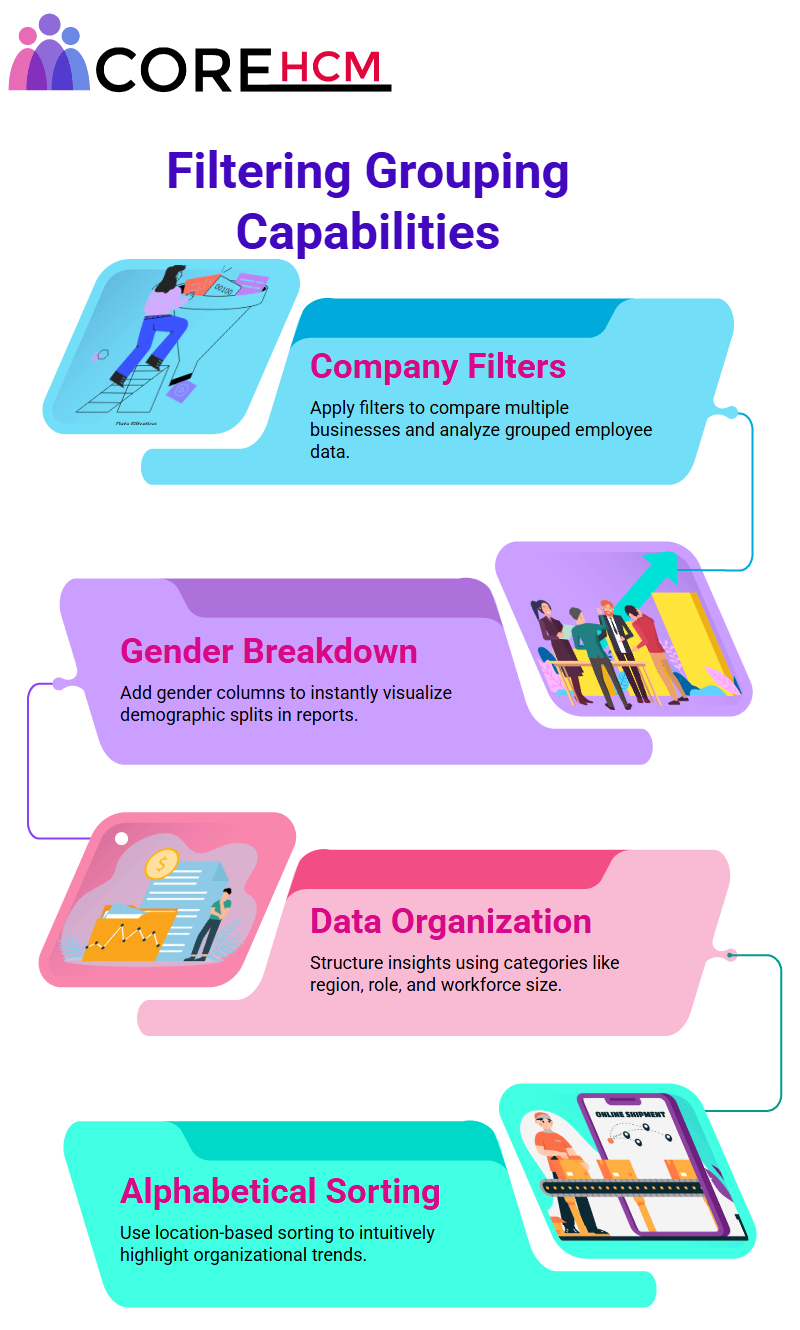
Gender distribution analysis across these companies shows that GMS Australia employs 11 people who can be easily broken down into male and female counts – adding column grouping for gender makes this easy to see at once.
Enhancing Workday Prism Analytics Reports with Parameters
Workday Prism Analytics allows for multiple grouping parameters. Recently, this report was expanded to cover companies with larger workforces – for instance in company ABC where 50 employees work, male-female breakdown helps highlight trends.
Gender grouping adds depth to analysis by showing how companies compare in terms of demographics.
Workday Prism Analytics then displays counts organized according to your parameters – in this instance 40 employees at GMS UK for example – while adding gender columns provides insight into worker distribution across companies listed.
Advanced Grouping Capabilities Workday Prism Analytics
With Workday Prism Analytics’ advanced grouping capabilities, grouping parameters are vast. You can organize data by company, country and employee location; up to eight row groupings and two column groupings may be possible!
Sorting data alphabetically by location provides an insightful and intuitive report, while further narrowing it by sub-groups will reveal which workers belong to what division. GMS Sweden only employs six employees while in GMS UK the data can be broken down further.
Workday Prism Analytics allows businesses to divide data according to parameters they set in place – for instance, one worker in France versus 39 employees in the UK for instance – dividing their information neatly in these categories.
Hyperlinked Workday Prism Analytics Details
Workday Prism Analytics makes data fascinatingly accessible by turning data into actionable insights.
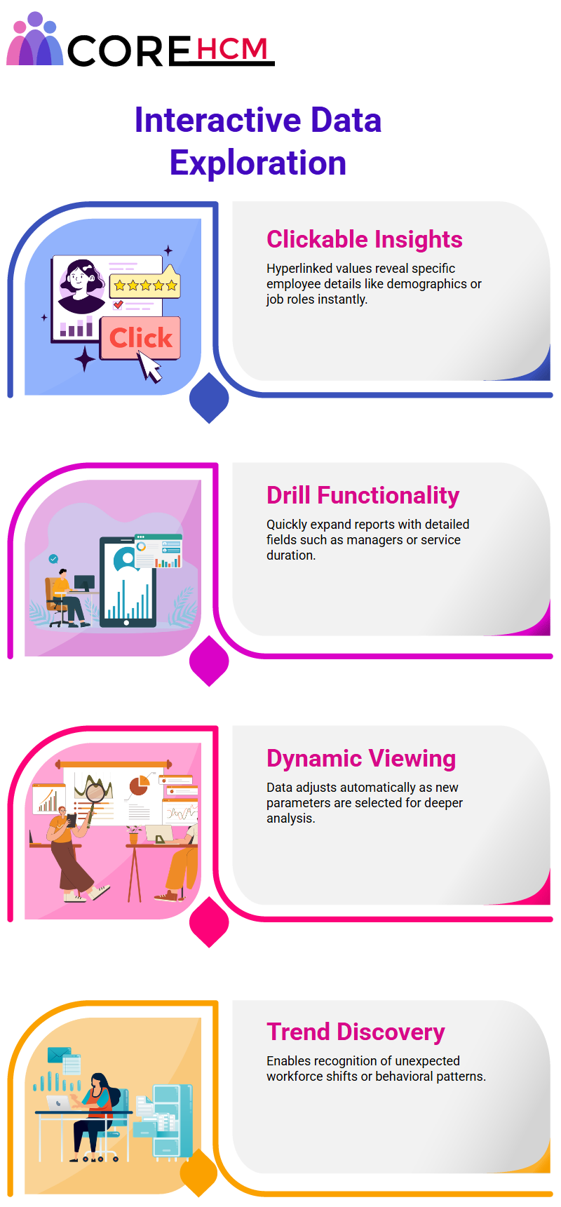
Every value serves as a hyperlink, so clicking one such as 70 employees allows exploration of their employment histories from various companies; clicking another such as 35 shows demographic breakdowns, for example, 21 male employees working within GMS UK in the UK.
These links lead directly to details about specific workers; for instance, someone living in Paris might belong to GMS UK but be located elsewhere.
Workday Prism Analytics automates this grouping process, enabling data to be viewed dynamically as selections are made, making Workday Prism Analytics an agile yet user-friendly way of examining workforce trends.
Exploring Workday Prism Analytics Course in Hyderabad further reveals its wide array of features.
Trying out Workday Prism Analytics can uncover insights that may not otherwise have been visible, such as identifying trends within out-of-field workforce trends analysis.
Exploring Workday Prism Analytics can be rewarding in many ways; one exciting aspect is the ability to unearth employee data.
Consider how this tool can be used to gain deeper insights. For example, retrieving details on 21 employees is just the start.
By adding further details, the view can be broadened even further to include job positions, hire details, job roles, and their managers.
Drill Down Features in Workday Prism Analytics
Anyone familiar with Workday Prism Analytics will quickly recognize its extensive reporting features as a game-changer.
By employing the drill-down option, for example, you can quickly and efficiently add detail data columns – for instance including worker job profiles or positions or supervisor details in just a few clicks – into reports rich with details regarding managerial details and service length.
Customizable Workday Prism Analytics Data
One key benefit of using Workday Prism Analytics is its ability to present detailed analysis rather than only summarizing high-level statistics.
With Workday Prism Analytics’ detailed data tab, you can specify exactly the fields you require – like advanced reports.
For instance, workers’ job profiles, positions and length of service information can all be added into one comprehensive report, tailored specifically for you.
It’s like having personalized reports tailored directly to meet your unique requirements!
Workday Prism Analytics Hyperlink Drill-Down
Workday Prism Analytics makes data easy to navigate with hyperlink drill-downs allowing for swift navigation through data.
Imagine clicking a number in a report and instantly being presented with all worker details behind that number.
Job profiles, positions or any other customized data that you’ve customized is visible as easily comprehensible metrics and data can be explored intuitively using Workday Prism Analytics Grouping Employees.
Grouping Employees in Workday Prism Analytics
Workday Prism Analytics’ distinct feature lies in its capability of grouping employees by specific characteristics such as age or grade.
Say you have a report with 70 employees; using grouping functionality you can easily filter
this data by age group and/or job grade to gain deeper workforce analysis insights.
By disabling drilling to details and streamlining my report to show only my predetermined grouping parameters.
Clicking directly on any number would open a ‘view by’ feature without showing detailed data, saving both time and allowing us to focus more quickly on high-level insights.
Workday Prism Analytics Data Sorting
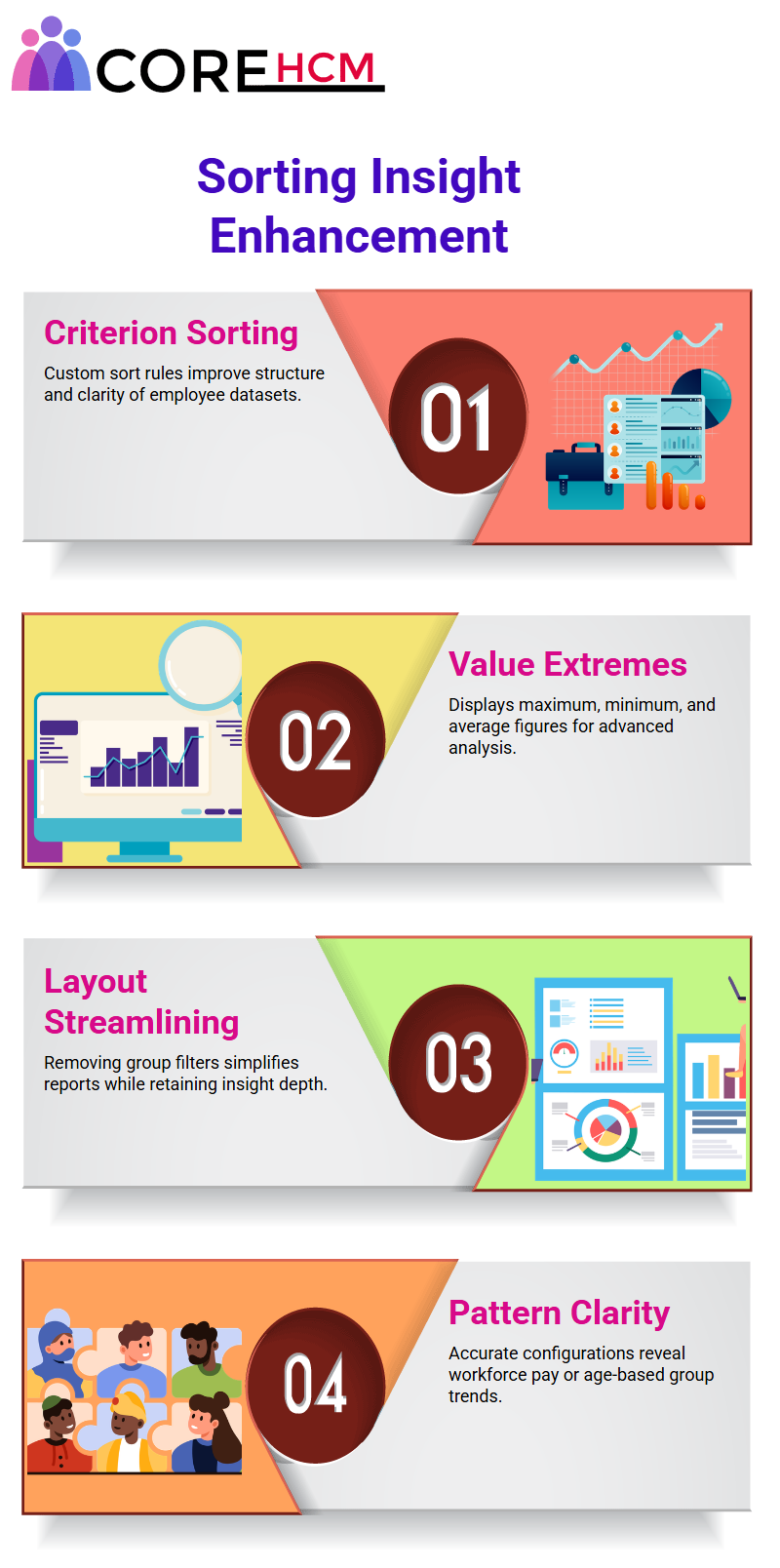
While investigating Workday Prism Analytics, an exciting discovery was made. In particular, its data provided was comprehensive yet easily structured for sorting purposes.
Prior to setting H as the sort criterion, data appeared alphabetically ascending by worker name.
Now however, by setting H as the sort criterion instead, all workers appear in alphabetic ascending order by H alone; effectively organizing chaos into clarity with Workday Prism Analytics.
Workday Prism Analytics Summarized Insights
Experimentation with summarizations proved impressive when applied to Workday Prism Analytics data, exceedingly even its default “count”.
Beyond showing average ages and maximum/minimum base pay for employees (for instance in one row grouping male employees averaged 44 years of age while their maximum base pay reached 46,848) This provided seamless yet actionable analysis results!
Navigating GMS Sweden’s data with Workday Prism Analytics revealed fascinating trends. For instance, two male employees with average age of 44 averaged in at 43 while maximum base pay reached 46,000; row and column groupings brought precision into analysis process.
Simplifying Reports Workday Prism Analytics
Reports can become complex quickly. To simplify matters further, gender was removed as an organizing criterion in this report.
Workday Prism Analytics Course in Hyderabad updated each company’s data accordingly, showing employee counts, average ages and extreme values such as maximum and minimum values to make the layout clearer without diminishing depth of detail.
This change improved layout without diminishing depth.
Data Analysis with Workday Prism Analytics
As work with Workday Prism Analytics progressed, its versatility continued to impress. By using company-level groupings as targets for analysis, insights such as average ages and base pays were demonstrated clearly.
Plus, its capacity for adding multiple summarizations and tailoring reports directly towards specific requirements revolutionized traditional approaches to data analysis.
Unleashing the Power of Workday Prism Analytics
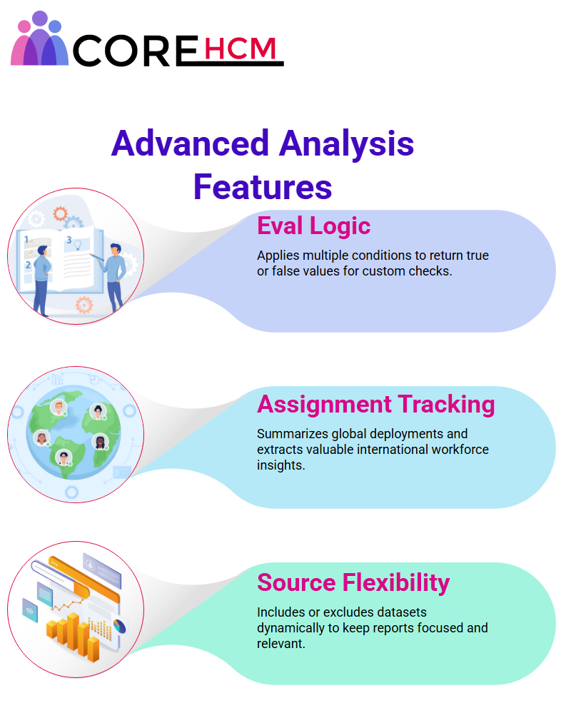
Recently, an investigation to identify managers within a region was being prepared using Workday Prism Analytics’ dynamic capabilities; different data sources could be added or taken away dynamically.
According to need – GMS US data being included revealed their presence while GMS Norway data was excluded to remain focused on only relevant insights.
Eval Expressions in Workday Prism Analytics
One standout feature of Workday Prism Analytics that truly stands out is the Eval expression. This powerful evaluation feature can evaluate multiple conditions simultaneously – useful. When trying to verify if an employee is manager or not; similar to having a Boolean field that returns true/false values depending on predefined rules in data fields like Excel.
Those looking to deepen their understanding can benefit from a Workday Prism Analytics Course in Hyderabad. However Workday Prism evaluates them efficiently instead, returning values only if one condition holds; otherwise, it checks against another predefined condition. It really couldn’t get simpler.
Customizing Reports with Workday Prism Analytics
Workday Prism Analytics made creating and refreshing reports an effortless task. A system was needed to accurately summarize international assignment values; multiple conditions could then be written using calculated fields of type “Eval expression,” returning specific values.
It was remarkable seeing these calculations provide valuable insights such as GMS US assignments total.
Workday Prism Analytics provided an effective means of recognizing and summarizing international assignments within GMS US’ 276 workers; its powerful feature made the job of collecting data easier while drawing meaningful insights.
Deep Insights Drilling down into data was another exciting feature of Workday Prism Analytics Course in Hyderabad, with clicking a row revealing detailed data regarding all 276 employees displayed initially; but then narrowed and customized to focus on two workers who were on international assignments specifically, without initially showing all 276 workers as initially displayed.
Workday Prism Analytics enabled for further refinement and customization to meet individual user requirements for customized reports.
Workday Prism Analytics was an indispensable data analysis solution, offering unrivalled levels of detail and customization, streamlining workflows and providing the clarity required for making data-driven decisions with confidence.
Workday Prism Analytics Provides Deeper Insights
With Workday Prism Analytics you have the capability to delve further into data, making it more actionable – one effective approach is changing detailed reports that contain this data.
Start by creating a column in the drill-down section to identify employees on international assignments by adding the field ‘is international assignment’ and sorting data by it.
Sorting by age was no longer enough; now the system uses this field in descending order to ensure all international assignments appear first in Workday Prism Analytics reports.
Once run, Workday Prism Analytics Course in Hyderabad displays data just like before but with one notable difference: international assignments appear first! Until a report runs and displays all this new information at once.
Clicking any row reveals whether an employee is on an international assignment, such as Gail Bradley and Owen Book who appear as such.
Opening Gail Bradley’s profile verifies this information – she indeed is on such an assignment.
International Assignments with Workday Prism
Workday Prism Analytics goes one step further by offering users the capability of going even deeper in terms of viewing only employee records on international assignments by creating detailed data overrides.
For example, in a report’s second column called ‘IA Count,” data overrides can help isolate only instances of employees on international assignments by adding an override; rather than showing default columns such as worker and age as standard data displays are replaced with these columns and conditions are set that filter out those not participating on such an international assignment.
Workday Prism Analytics Course in Hyderabad highly precise results when running this updated report, showing only employees currently on international assignments in two columns; with its override feature in place, drilling down quickly reveals only relevant details for three employees currently overseas without wading through irrelevant details.
Workday Prism Analytics truly simplifies customizing data views according to individual needs.